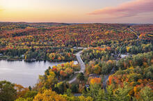
Capturing the Beauty of Fall on Camera
You know fall is coming when a couple of leaves start the show with a dash of colour, not many, but just enough to announce the seasons are about to change. The days start later, the mornings have a chill to them, the mist drifting across the lakes and rivers all signaling the start of fall.
There is a silence in the forest now. The migratory birds have started their journey south and ones who stay behind are bulking up for the approaching winter. The vibrant summer greens of the forest canopy are not so anymore. Nature has stopped making chlorophyll and so those leaves are now showing their fall outfits. If there is one thing fall inspires it's the desire to capture its majesty through pictures.

Before Pressing the Shutter
The camera is at the ready, our senses are overloaded with so much colour in front of us, what next? In some cases, it is like a hundred sunsets are painting the landscape. We are eager to capture the magic of this season with our photos. Wait for a moment, there is more to it than just pressing the shutter.
Remember, a photograph sends a message and is intended to communicate something to the viewer. The photographer must take on the role of visual storyteller and editor as you begin to make choices that impact the narrative (the image) you are creating. In photography, the narrative is related to the idea of context. No matter how complete or comprehensive a narrative appears, it will always be the product of including some elements and excluding others.

Composition
What you put into a composition is as important as what you leave out. It is all part of what composing a photograph is all about. Context then becomes “What is it I am trying to say?” And the 21st century has taken our attention span down to three seconds, so first glances of your images can be deceptive.

By utilizing a variety of camera controls and creative tools, you as a storyteller can begin to craft a narrative through your imagery by highlighting what is important, what is not.
We need to look as to how a photograph is composed which can have a significant impact on how we interpret it. An image needs to engage the viewer in a meaningful way. Using creative controls such as composition, light, colour, & contrast is part of the formula. One must focus on the relative size of objects within a frame, the lines, and layering that you can use to consciously create an image that tells the story YOU want to tell.

Rule of Thirds
One of the easiest is the rule of thirds. You take the image and divide it horizontally and vertical in thirds (see image). At the intersecting lines, your centre of interest is placed. It could be a person, an object, something that allows the eye to make contact with it, then moves around the image landing back on the centre of interest. It’s what catches the viewer’s eye and draws them in.

Composition tells a story. It’s as if the viewer is reading a book. Where do you want them to start and what will they come away with; good composition brings everything together in one cohesive look.
Visual Tension
Another way is by using visual tension. This is another compositional technique that uses a variety of framing approaches to create dynamic elements in a photograph to draw and provoke the viewer's eyes. This is what prompts the viewer to spend more attention trying to understand it or at least look at an image longer.

When to Photograph
Another thought is the quality of the light; the time of day one chooses to photograph, how long one waits for the light to change. Early morning or late afternoon works well as the light is warmer and there is not as much contrast. Don’t discount overcast days, the lack of contrast and shadow can provide softer light, creating a different emotion.

Colour
Last but certainly not the least, let’s look at colour since it is probably the biggest reason for photographing during the fall. It can play a big factor in your imagery. A little colour theory here.

Watch for complementary colours; oranges — blues, reds — greens, yellows — purples, these combinations all make a big difference in creating your images. The oranges of the oak leaves contrasted with the blue of the sky will make a striking image.

A little more complex are analogous colours. These are groups of three colours that are next to each other on the colour wheel. Red, orange, and red-orange are examples. An analogous colour scheme can create a vibrant, monochromatic look.

Final Thoughts
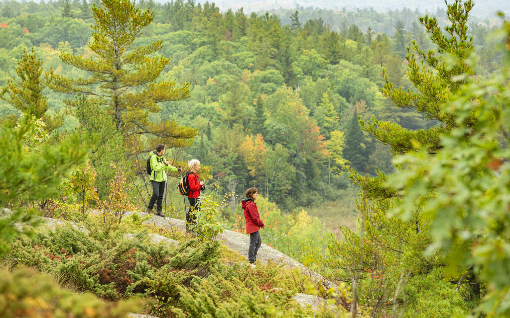
Creating interesting and compelling images takes patience and a good eye. The check list is long. Look at other photographers work, take a workshop, go to a museum or the library to learn what makes good imagery. It is worth the effort.
Storyteller: